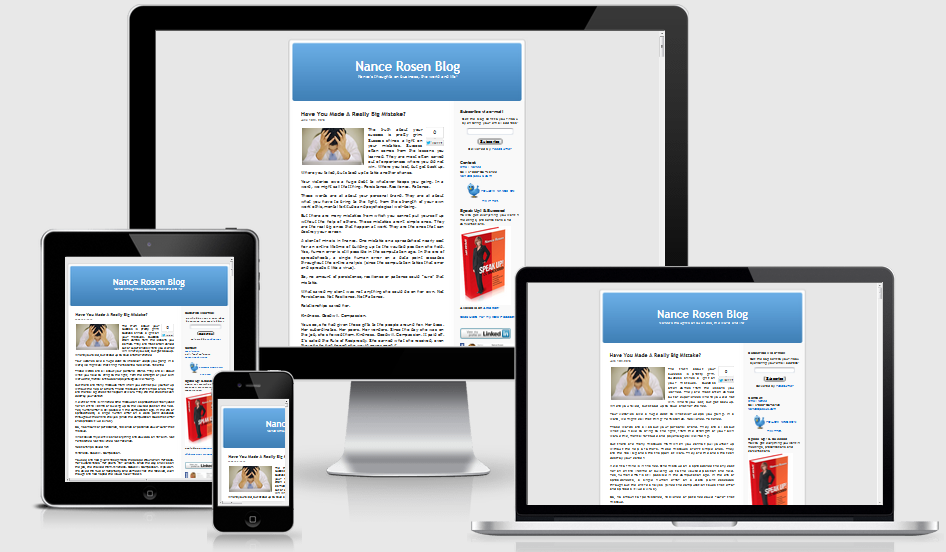
We use various devices to view websites, from laptops to smartphones to tablets. Responsive design allows your website to display content on different devices without sacrificing user experience.
What is Responsive Design?
Responsive design refers to a technique that enables websites to change their layout and content based on the device being used to view them. The design literally responds to its environment. For example, if your site uses responsive web design, a visitor who opens it on an iPhone will see a layout that is optimized for that phone’s smaller screen.

How do I make a design responsive?
To make a design responsive, your web design and development team will consider how different devices are going to handle the design and how users are going to respond to that design.
Designers will create a flexible appearance that can deliver complementary layouts for the various screen size options while maintaining brand integrity. Developers create the code and add media queries, which are pieces of code that check the size of the screen being used and display the appropriate layout and content for that screen. Everything from image size to the navigation structure may need to change between devices to ensure a good user experience.
Today’s web development is not about one-size-fits-all solutions; it’s about taking advantage of the opportunities presented by new technologies. Responsive web design requires early planning, but the reward is a flexible, beautiful site that works as well on a smartphone as a desktop.
Why it matters

The size of the screen and the method of input (keyboard or gesture) have tremendous impact on how visitors interact with your site, and people are now moving between multiple devices to access online content.
According to the Pew Research Center, among American adults, 58 percent have a desktop, 61 percent have a laptop, 46 percent have a smartphone, and 18 percent have a tablet. Microsoft predicts that mobile will overtake non-mobile internet use by 2014.
Mobile technologies are changing the way consumers interact online, but many companies are not changing to accommodate their clients. Neil Patel, founder of KISSMetrics, notes that while more than half of smartphone users will buy from a mobile site, less than 5 percent of brands actually have a mobile site.
Ignoring responsive web design could be a huge mistake for any brand, as a bad mobile experience will give your visitors a bad impression of you. According to Compuware, 40 percent of visitors will go to a competitor if you don’t offer a good mobile experience.
Responsive web design is one way to help ensure a good user experience across multiple devices. A good user experience can translate to more visitors, more sales, and a stronger overall web presence.
According to Forbes, “Beginning April 21, Google will use mobile-friendliness as a ranking signal in search results, rewarding websites that are fully optimized for mobile platforms.
Most modifications to the all-important Google Search Algorithm have only a low-weight impact on search results, however Google says the effect of this change will be profound. It is very important for any business owner with a website to respond accordingly.”